It’s no secret that mobile-friendly sites are important today and will be even more important in the future. Many distributors’ website visitors are in the field and very mobile, so this future change is important.
The Future is Now!
There has been a lot of talk in recent weeks about Google’s search engine algorithm changes, with the impact being: “go mobile-friendly or be penalized”. You can read the Google announcement here. The changes started rolling out this week, and Google announced that there are 4.7% more mobile-friendly sites today versus just a couple months ago. It is quite possible that content on a website ranking high prior to the change may be much lower now on mobile devices.
There is an important distinction – the changes only impact searches done on a mobile device, specifically a smartphone. Tablets are not impacted, per Google.
The good news is that if you already have a mobile-friendly site, you might see a boost in your rankings. Conversely, if your competition has a mobile-friendly site and you don’t, that means your competition just got a leg up on you, thanks to Google.
This is big news, in that Google rarely provides detailed glimpses into its sophisticated algorithm changes. The significant change is that search results in Google will begin showing more mobile-friendly sites. Why? It’s a continued trend to show users more relevant content in the search engine results page (SERP) on Google.
Check to See if Your Website is Mobile-Friendly
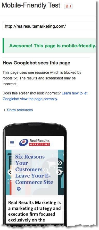
- Fortunately, you can check a few pages to see if your site is ready.
- Ideally, you’ll want to see the result look something like this image below
- Next, log into your Google Webmaster Tools account to check your entire site. You’ll get a specific list of URLs with issues. Common issues you may find include:
- Pages with Flash usage that cannot be viewed on mobile devices.
- Viewport not configured. That means you need to specify a viewport using a meta viewport tag, which tells a browser how to modify the page size for the specific device used.
- Fonts are too small.
- Touch elements too close. Button and navigation links can be too close for a mobile user to easily tap.
- How fast is your website? Speed matters, especially with mobile browsers. You can check your speed at Pingdom. In addition to getting a performance grade for your site, you’ll see a useful waterfall for each component that loads on a page to more easily identify areas that may be slowing your visitors down.

What is the solution?
Sites using responsive design give a user an optimal viewing and navigation experience regardless if they are on a desktop, tablet, or smartphone. As you might expect, Google has a detailed guide for responsive design.
When using a responsive design, as the page is resized — or the screen is smaller as with a smartphone — the site content adjusts to view appropriately for the screen size.
If your website hasn’t gone through these exercises, don’t panic or overreact. Remember, searches done on a tablet or desktop are not affected. It’s important to take your time and make changes the right way. If not already completed, a thoughtful mobile-friendly strategy should be on your radar.
I hope this information is helpful. Let us know if we can answer questions for you!
Dean Mueller is Independent Consultant at Distribution Strategy Group. He has more than 30 years of experience in sales and marketing and helps distributors build holistic digital strategies that drive a significant shift to online sales, improve profitability and grow customer satisfaction. Take your digital strategy to the next level. Contact Dean at dmueller@distributionstrategy.com.

